Surface Analysis Chart
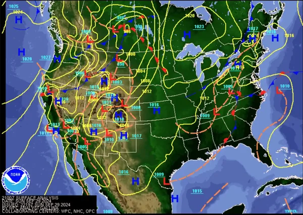
Surface analysis charts depict analyzed surface observations, sea-level pressure, pressure systems, fronts, troughs, and other boundaries to show weather patterns at the chart's valid time.
Introduction to Surface Analysis Chart
- A surface analysis chart, also called a surface map or sea-level pressure chart, is an analyzed depiction of surface weather observations.
- The Weather Prediction Center (WPC) issues surface analysis charts for North America every three hours. The analyses are available from WPC, AviationWeather.gov, and other weather providers.
- Charts provide a macro look at pressure systems across a geographic area.
- Depicted with various symbology through the use of station reporting, pilots can build a picture for flying greater distances.
- Test your understanding of Surface Analysis Chart by completing the knowledge quiz, applying your knowledge in the interactive scenario, comparing your performance against the applicable Airman Certification Standards, and concluding with the topic summary to reinforce the key concepts before moving on to the next lesson.
Surface Analysis Chart Key Highlights
- Surface analysis charts depict analyzed surface weather conditions and pressure patterns at the chart's valid time.
-
Pilots use surface analysis charts to identify fronts, pressure systems, boundaries, and overall weather patterns.
- Precipitation may appear in station models or on versions combined with radar imagery.
- The charts display high-pressure systems, low-pressure systems, stationary fronts, warm fronts, cold fronts, and occluded fronts.
- Pressure gradients shown on surface analysis charts help pilots anticipate wind strength and general weather movement.
- Surface weather patterns influence visibility, turbulence, precipitation, cloud development, and convective activity.
- Pilots should evaluate frontal movement and pressure trends when planning routes, alternates, and fuel requirements.
- Surface analysis charts combine weather observations from multiple reporting stations into a unified weather overview.
- Weather systems shown on the charts may evolve rapidly, requiring pilots to obtain updated weather information before and during flight.
- Surface analysis charts are commonly used with radar imagery, prognostic charts, METARs (Aviation Routine Weather Reports), and weather advisories for comprehensive weather planning.
- Understanding surface analysis charts improves weather interpretation, strategic planning, and overall flight safety.
Surface Analysis Charts
- A surface analysis chart is an isobaric analysis showing identifiable, organized pressure patterns: []
- Isobars connect points of equal mean sea-level pressure and reveal organized pressure patterns.
- The chart identifies highs, lows, ridges, troughs, fronts, and other boundaries, including drylines, outflow boundaries, and sea-breeze fronts.
- Available versions may include surface point of observations such as station models, radar imagery, satellite imagery, or different geographic backgrounds.
Surface Analysis Chart Issuance & Validity
- The WPC issues North American surface analysis charts eight times daily, valid at 0000, 0300, 0600, 0900, 1200, 1500, 1800, and 2100 UTC (Coordinated Universal Time).
- The chart's VT (valid time) identifies the analysis time, not a forecast period.
- The product is generally available approximately two hours after its valid time; pilots should check the timestamp before using it operationally.
- The chart is an analysis, not a forecast; however, plotted station information represents observations, while the completed analysis may also incorporate upper-air observations, satellite imagery, radar data, and model fields.
Pressure Systems & Isobars
- Pressure systems are areas of like pressure.
- H identifies a high-pressure center.
- L identifies a low-pressure center.
- The value plotted near a pressure center gives its analyzed central mean sea-level pressure in millibars or hectopascals.
- Isobars are solid lines connecting points of equal pressure.
- On NWS (National Weather Service) surface analysis charts, isobars normally use a 4-millibar (4-hectopascal) interval.
- Millibars and hectopascals are numerically equivalent: 1 mb = 1 hPa.
- Closely spaced isobars indicate a stronger horizontal pressure gradient; widely spaced isobars indicate a weaker gradient.
- When necessary, intermediate isobars may be drawn with short dashed lines at half the standard interval.
Frontal & Pressure Markings
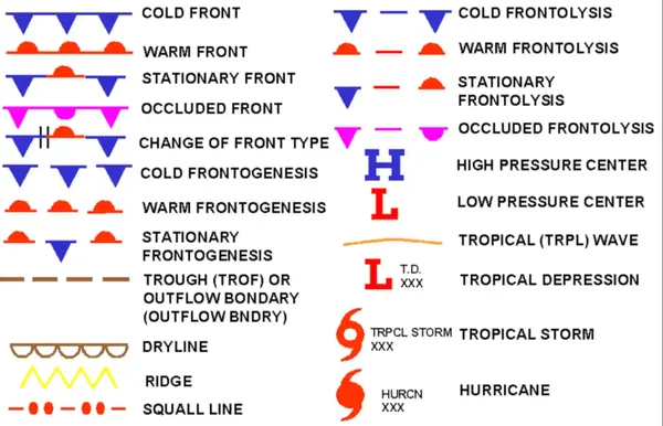
- Frontal and Pressure systems are symbolically marked across affected areas on surface analysis charts. []
-
Troughs:
- A trough is an elongated area of relatively low atmospheric pressure and is depicted by a dashed line.
- It is identified with the word "TROF."
- A ridge is an elongated area of relatively high atmospheric pressure and may be depicted by a zigzag line.
- An OUTBNDY (outflow boundary) may use the same dashed symbol as a trough and is identified by its chart label.
- A trough is an elongated area of relatively low atmospheric pressure and is depicted by a dashed line.
-
Dry Line:
- A boundary separating moist and dry air masses.
- A DRY LINE (dryline) is depicted by an unshaded scalloped line and identified by its chart label.
- It typically lies north-south across the central and southern high Plains states during the spring and early summer, where it separates moist air from the Gulf of Mexico (to the east) and dry desert air from the southwestern states (to the west).
-
Squall Lines:
- A squall line is a line of active thunderstorms, either continuous or with breaks, including contiguous precipitation areas associated with the thunderstorms.
-
Tropical Waves:
- A trough or cyclonic curvature maximum in the trade wind easterlies.
-
Fronts:
- A three-digit number near a front classifies it as to type, intensity, and character enclosed in brackets ([ or ]).
- An expanded explanation of each front can be found at https://www.wpc.ncep.noaa.gov/html/fntcodes2.shtml.
- A three-digit number near a front classifies it as to type, intensity, and character enclosed in brackets ([ or ]).
-
Frontal Changes:
- Two short lines (hash marks) drawn across a front indicate a change in frontal type.
- The lines are drawn perpendicular to the frontal boundary.
- They are not drawn at "triple points" (the intersection of an occluded, cold and warm or stationary front) and where a low pressure center separates the different frontal types.
-
Frontogenesis:
- Frontogenesis is the formation or strengthening of a front or frontal zone.
- A developing front is depicted with interrupted frontal symbols separated by dashed segments.
-
Frontolysis:
- Frontolysis is the weakening or dissipation of a front or frontal zone.
- A weakening front is depicted with frontal symbols separated by longer blank or dashed segments.
Surface, Aviation, and Ship/Buoy Station Models
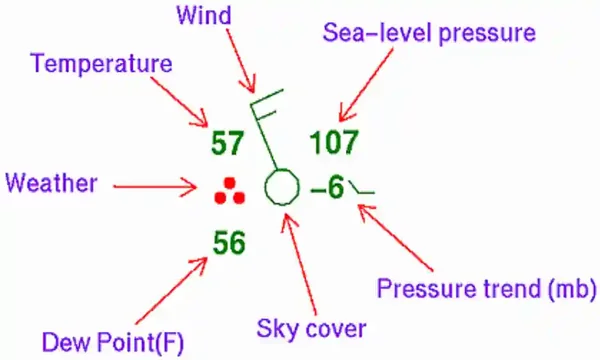
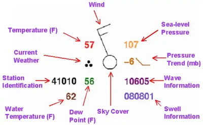
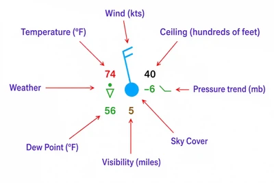
- These plotted observations are referred to as station models and they represent a specific geographic point.
- While all stations available may not be displayed due to space limitations, all are factored into the analysis.
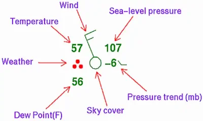
- A station model uses a standardized arrangement of symbols and values to summarize an observation.
- Each station is a single point of data; however, when taken together they help identify temperature gradients, pressure patterns, wind shifts, fronts, and other boundaries.
-
Station Observation Products:
- Regional surface analysis chart products provide station plot models. []
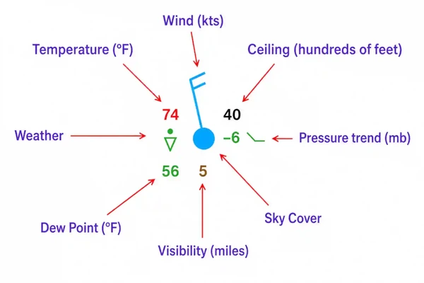
- Aviation-specific models provide airborne focused plots. []
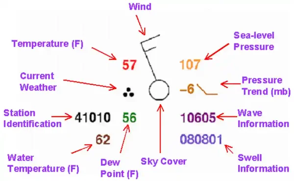
- Land, ship, buoy, and C-MAN (coastal-marine) stations are plotted on the chart to aid in analyzing and interpreting surface-weather features. []
-
Temperature/Dew Point Plot:
- Air temperature and dew point is reported in whole degrees Fahrenheit.
- Air temperature is plotted to the upper left of the station circle, and dew point is plotted to the lower left.
- Temperature becomes much more useful when compared with the dew point directly below it.
- The difference between temperature and dew point is the temperature-dew point spread.
- A small temperature-dew point spread indicates air approaching saturation and should alert pilots to the potential for clouds, fog, or other visibility restrictions when other conditions are favorable.
- Looking at temperatures across several stations can also help identify air masses and frontal boundaries.
-
Present Weather Plot:
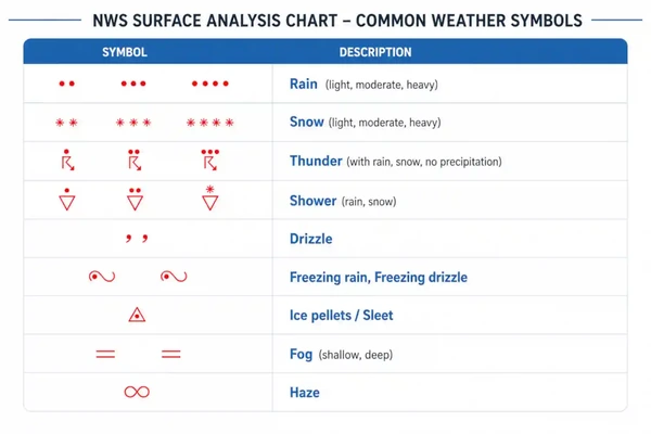
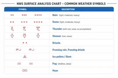
- When present weather is reported, its symbol is plotted immediately to the left of the station circle. []
- Plotted when precipitation is either occurring or a condition exists causing reduced visibility.
- Symbols allow precipitation and restrictions to visibility to be recognized quickly without writing out the weather condition.
- The important pilot skill isn't simply memorizing symbols; it is recognizing patterns across multiple stations.
- For example, widespread precipitation along a boundary tells you much more than the symbol at one isolated station.
-
Wind Plot:
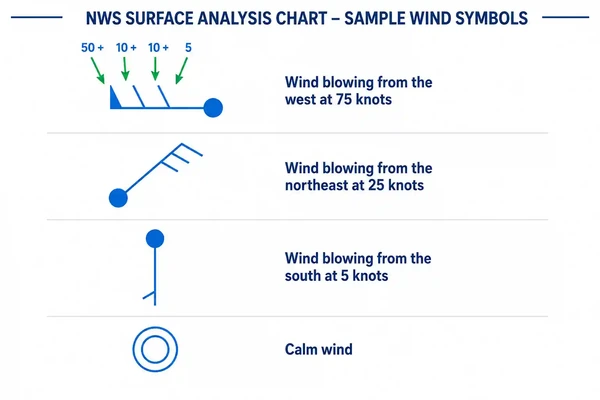
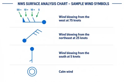
- The wind staff extends from the station circle toward the direction from which the wind is blowing, while flags/pennants and barbs indicate wind speed. []
- The wind direction is referenced to true north.
- Wind speed is determined by adding the values of the flags/pennants (50 knots), barbs (10 knots), and half-barbs (5 knots) found on the stem.
- If the wind is calm at the time of observation, only a single circle over the station is depicted.
- Comparing wind direction between neighboring stations can reveal wind shifts, convergence, frontal boundaries, and circulation around pressure systems.
-
Sky Cover Plot:
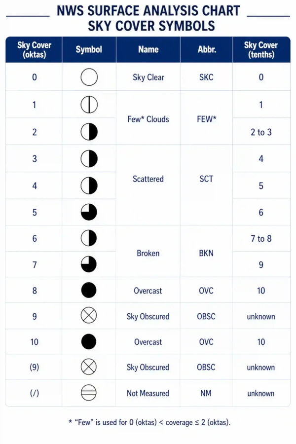
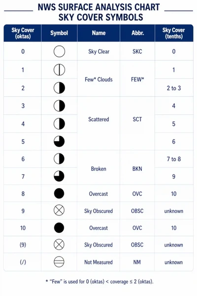
- The amount of shading within the station circle indicates the fraction of the sky covered by clouds. []
- Sky cover is expressed in oktas, or eighths of the sky.
- The progression from clear through few, scattered, broken, and overcast allows pilots to recognize cloud coverage visually without reading a coded report.
- Broken and overcast conditions are particularly significant because the lowest broken or overcast layer constitutes a ceiling.
- Station plots are especially useful when comparing sky cover geographically; a line of stations transitioning from clear/scattered to broken/overcast can help visualize the extent of a weather system.
-
Visibility Plot:
- Prevailing visibility is plotted in whole statute miles to the left of the present-weather symbol.
- Visibility should be considered together with present weather and sky cover rather than as an isolated value.
- Reduced visibility accompanied by precipitation, fog, haze, or other obscurations helps identify areas where VFR (Visual Flight Rules) conditions may deteriorate.
- Comparing visibility between stations provides a quick picture of the geographic extent of reduced visibility.
-
Sea-Level Pressure Plot:
- Encoded sea-level pressure is plotted to the upper right of the station circle. []
- Sea level pressure is plotted in tenths of millibars, with the first two digits (generally 10 or 9) omitted.
- Example, 410: 1041.0 mb.
- Example, 987: 998.7 mb.
- For reference, 1,013 mb is equivalent to 29.92 inHg.
- More important than the pressure at a single station is the pressure pattern across multiple stations, which helps locate highs, lows, troughs, ridges, and pressure gradients.
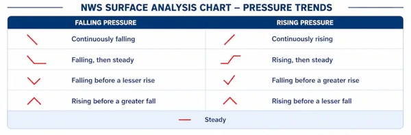
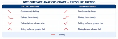
- The three-hour pressure tendency is plotted to the lower right and indicates the amount and character of the pressure change in tenths of millibars.
- Example: -6: decrease of 0.6 millibars over past 3 hours.
- The plotted number indicates the amount of pressure change, while the accompanying tendency symbol describes the character of that change.
- A rapidly falling pressure trend can indicate an approaching or strengthening low-pressure system, while rising pressure commonly accompanies improving conditions behind a departing system—but pilots should interpret the trend together with the surrounding weather pattern.
- Comparing tendencies between several stations can help reveal the movement and development of pressure systems.
-
Ceiling Plot:
- When a ceiling is reported, its height is plotted in hundreds of feet above ground level.
- Ceiling information is operationally significant because low ceilings may affect VFR operations, approach selection, alternate planning, and airport accessibility.
- When comparing station models, pilots can quickly see where ceilings are improving or deteriorating across an area.
-
Station Identifier:
- Some stations may use a station identifier, which is presented as a code, and corresponds to the geographic plot.
-
Water Temperature Plot:
- Water temperature is plotted in the lower right of the station.
- Water temperature is plotted in whole degrees Fahrenheit.
-
Swell Plot:
- Swells are plotted on the lower right of the station.
- Swell direction, period, and height are represented in the surface observations by a six-digit code.
- The first two digits represent the swell direction, the middle digits describe the swell period (in seconds), and the last two digits are the swell’s height (in half meters).
- Example, 090703: 09: The swell direction is from 90° (i.e., it is coming from due east). 07: The period of the swell is seven seconds. 03: The swell height is three half-meter units, or 1.5 meters.
- Example, 271006: 27: The swell direction is from 270° (due west). 10: The period is 10 seconds. 06: The height of the swell is six half meters.
-
Wave Information Plot:
- Wave information is plotted on the lower right of the station.
- Period and height of waves are represented by a five-digit code.
- The first digit is always 1, the second and third digits describe the wave period (in seconds), and the final two digits give the wave height (in half meters).
- Example, 10603: 1: A group identifier. The first digit will always be 1. 06: The wave period is six seconds. 03: The wave height is three half meters.
- Example, 10515: 1: A group identifier. 05: The wave period is five seconds. 15: The wave height is 15 half meters.
- In some charts by the OPC (Ocean Prediction Center), only the wave height (in feet) is plotted.
-
Human Versus Machine Reporting Plot:
- Round station symbols indicate observations taken by an observer.
- Square station symbols indicate the sky cover was determined by an automated machine.
- Automated and human observations use different methods for some visually observed elements.
- The FAA notes that objective elements such as pressure, temperature, dew point, and wind generally produce similar results, while subjective elements such as sky condition, visibility, and present weather involve differences in how human and automated observations sample the atmosphere.
- This matters because an automated observation represents conditions detected by sensors at or near a specific point, and may not capture everything a pilot could encounter around the airport.
Surface Analysis Chart Interactive Scenario
Interactive Scenario
Loading scenario details...
Scenario Complete
Surface Analysis Chart Knowledge Check
Choose the knowledge check that matches your current training for Surface Analysis Chart.
 Private Pilot
PPL knowledge check
Core Knowledge Review
Review foundational knowledge, key concepts, and practical considerations. Topic: Surface Analysis Chart.
- Immediate feedback
- Answer explanations
- Account progress tracking
 Commercial Pilot
CPL knowledge check
Advanced Application
Apply knowledge to advanced operations, risk management, and aeronautical decision-making. Topic: Surface Analysis Chart.
- Immediate feedback
- Answer explanations
- Account progress tracking
Why Take a Quiz?
Quizzes reinforce key concepts, identify knowledge gaps, and build confidence for real-world decisions. Quiz material is representative of the information provided here and is not based on or sourced from the Federal Aviation Administration test bank.
Surface Analysis Chart Conclusion
- Some of the WPC’s surface analysis charts are combined with radar or satellite imagery as well as having different background features (e.g., terrain).
- When reading station plot temperatures, remember temperature is always higher than dew point, both in value and it's display location.
- For more information, a paper copy of Federal Aviation Administration (FAA-H-8083-28) Aviation Weather Handbook [Amazon] is available for purchase.
- A digital copy of the Federal Aviation Administration (FAA-H-8083-28B) Aviation Weather Handbook is available from the FAA.
- Improve your weather skills with FAA provided (and WINGS credited) resources by going to https://www.faasafety.gov/ and type "weather" into the search bar
- Still looking for something? Continue searching:
Surface Analysis Chart References
- Federal Aviation Administration (FAA-H-8083-28B) Aviation Weather Handbook.
- Federal Aviation Administration - Pilot/Controller Glossary.
- Aviation Weather Center - Graphical Forecasts for Aviation.
- Aviation Weather Center - Graphical Forecasts for Aviation Help.
- Weather Prediction Center - North American Surface Analysis.
- Weather Prediction Center - Surface Analysis Product Description.
- CFI Notebook.net - Atmosphere.